Quick answer
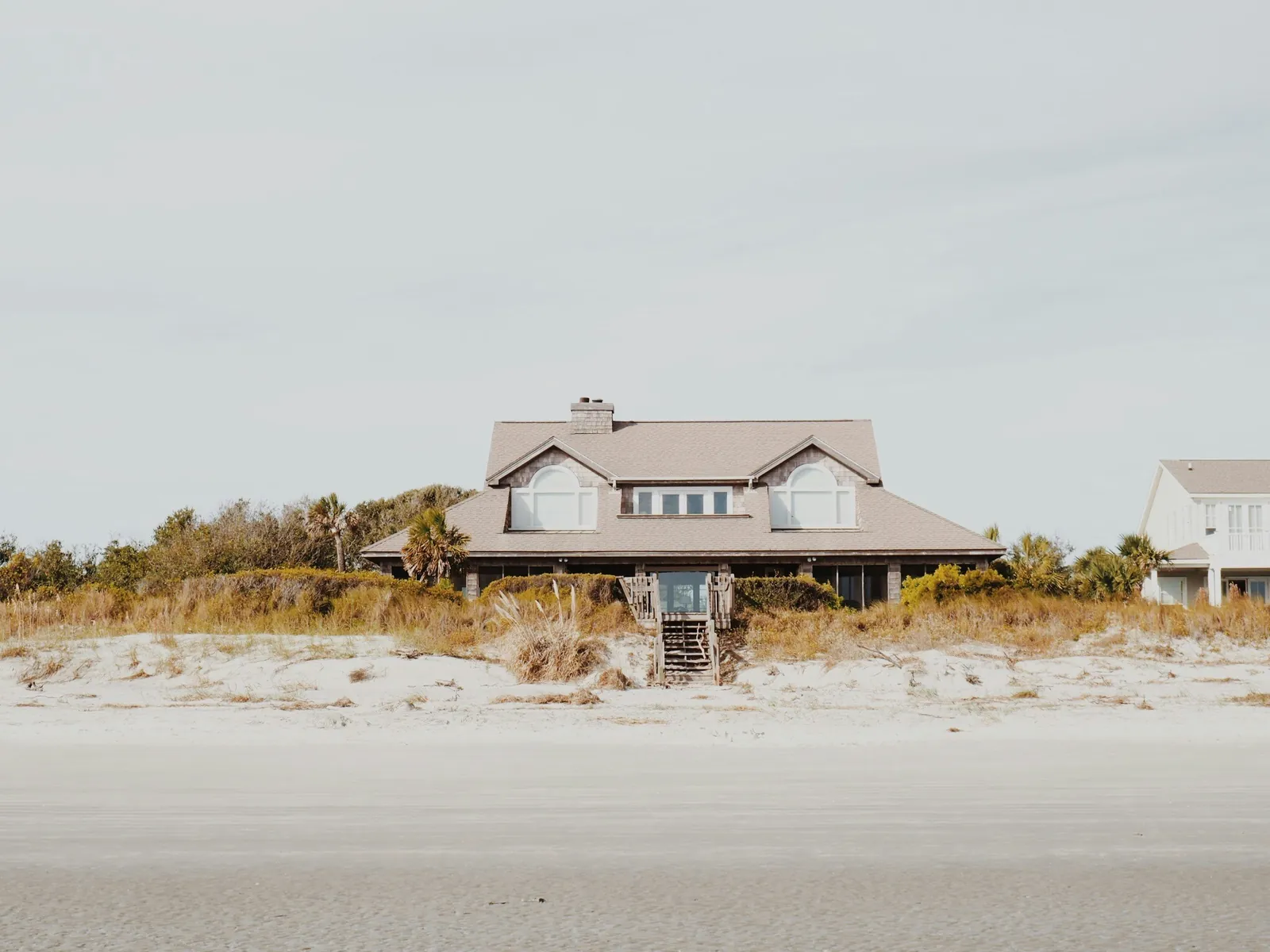
A coastal palette can be warm, muted, natural, historic, or modern. The strongest choices respond to the home rather than copying a generic beach theme.
Start with fixed materials
Roofing, stone, pavers, flooring, countertops, tile, cabinets, and wood tones create the palette boundaries.
Paint should coordinate with these items rather than fight them.
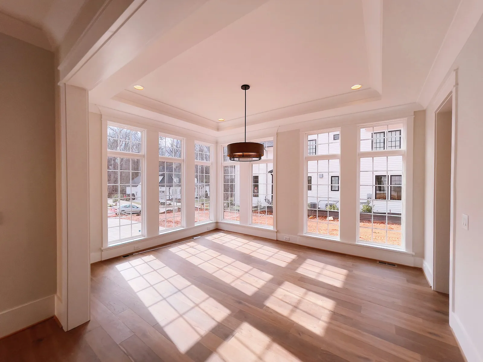
Use light intentionally
Bright coastal daylight can wash out subtle exterior colors, while shaded porches and north-facing rooms can make the same color appear cooler.
Test large samples at several times of day.
Interior color flow
Soft whites, sandy neutrals, muted greens, watery blue-grays, warm taupes, and deeper accents can all work when undertones are coordinated.
Limit the palette enough to create continuity without making every room identical.
Exterior scale and approval
Large exterior surfaces can look lighter and stronger than a small chip. Roof, trim, shutters, doors, and landscaping should be considered together.
Historic properties may have separate color guidance or review requirements.
Homeowner comparison checklist
- Photograph fixed finishes in daylight
- Identify warm or cool undertones
- Choose three finalists, not fifteen
- Use large movable samples
- Observe morning, noon, and evening
- Confirm exact product and sheen
Frequently asked questions
Do coastal homes have to be blue?
No. Many successful coastal palettes use warm white, sand, sage, gray-green, tan, taupe, charcoal, natural wood, and restrained accents.
Should exterior trim be pure white?
Pure white can be striking, but softer whites often coordinate better with warm roofs, pavers, and stucco. Sample the combination together.
Can a dark front door work in Florida sun?
It can, but heat gain, door material, sun exposure, manufacturer limitations, and fading should be considered.